& Construction

Integrated BIM tools, including Revit, AutoCAD, and Civil 3D
& Manufacturing

Professional CAD/CAM tools built on Inventor and AutoCAD
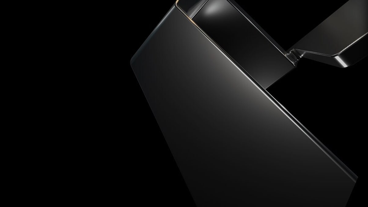
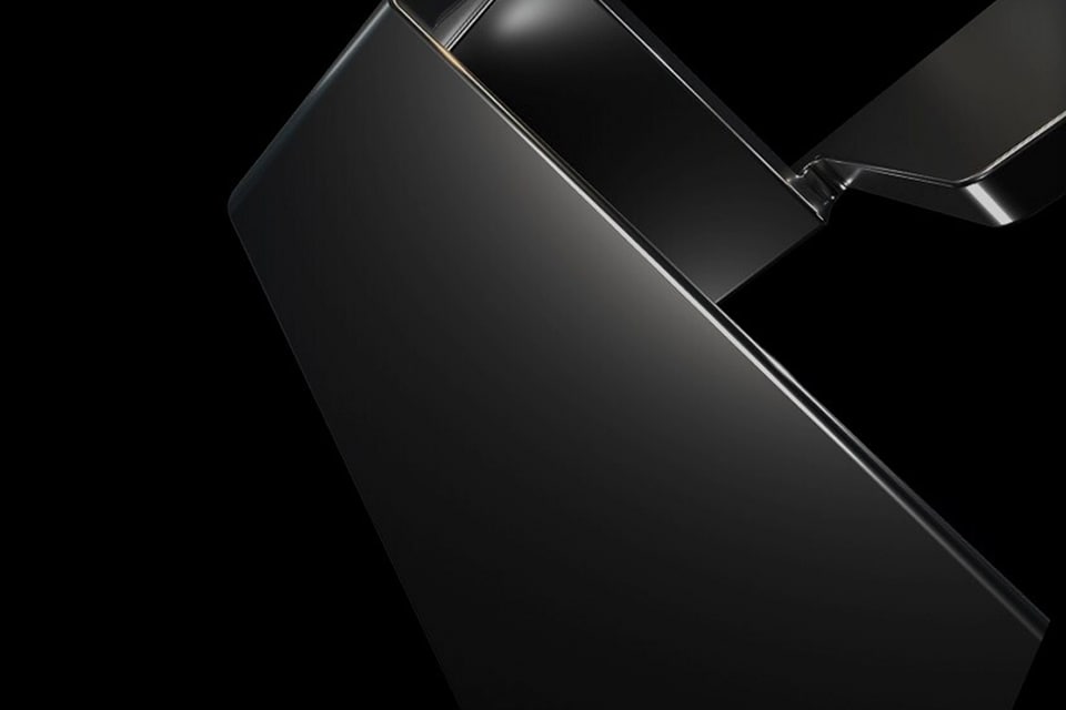
Evocative, inspiring, and intriguing, our brand images reflect who we are in a powerful and memorable way.
Brand images are not focused on a specific product or industry. Brand images are versatile, abstract, and dynamic compositions that serve as backdrops to brand-level assets and experiences. They have their roots in our symbol and in abstract 3D geometric forms and use tight cropping to make them feel dynamic.
Brand colors: 80-100%
Most of the image is set in our brand colors: black or white—natural grays happen from lighting in 3D, and that’s okay, and on brand. Depending on your format size, brand colors should take up 80 to 100% of the composition.
Colorful reflection: 0-20%
We use these colors only as highlights or reflection of the material the symbol is made of. Colors should only take up 20% (max) of the layout.
Brand images help to add a unifying visual element to layouts that are centered around the Autodesk parent brand. Designers are free to rotate and crop brand images to achieve a balanced composition. But be careful not to take it too far.
Some general rules to keep in mind:
Brand images can be rotated and cropped to suit many purposes, following our ratio rule.
Black brand images portray confidence and drama, characteristics that run through the brand ethos of the Autodesk identity.
For applications where a strong black background is not practical or doesn’t make sense, lighter brand images are available on the DAM (access required).

